![]()
Web-based interactive visualizations
Comorbidity4j generates a Web-based interactive visualizations of the result of comorbidity analyses: these visualizations allows to explore several facets of the input dataset, access the results of the comorbidity analysis and interactively filter and explore them by means of heatmaps and network visualizations.
An example of interactive Web-based visualization of the results of comorbidity analysis can be accessed at: from this link.
Users can access these visualizations by means of their Web browser. Each visualization includes the following sections that can be browsed by means of the following menu:

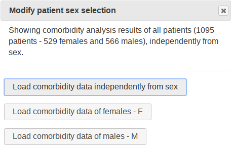
By clicking on the gear button shown at the right side of the previous menu, it is possible to switch among different datasets to consider in the visualization: all patient data, only female data or only male data, by means of the following pop-up menu:
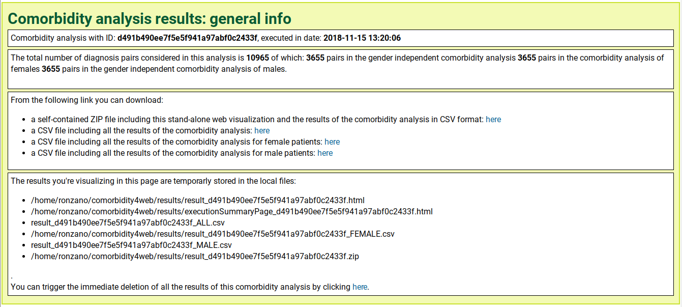
General information on the analysis
General information and links to download the results of the analysis.
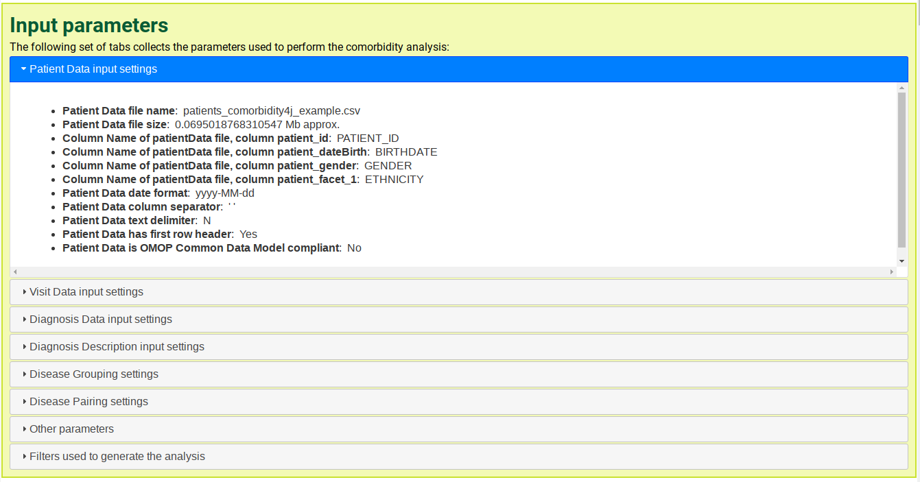
Input parameters overview
Overview of all the input parameters used to perform the comorbidity analysis, divided in seven sections (Patient Data input settings, Admission Data input settings, etc.).
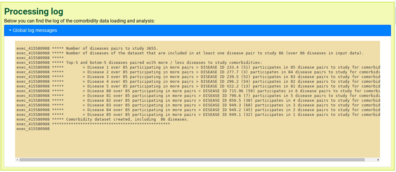
Processing log
Logging output and detailed input concerning data loading and the execution of the comoridity analysis. This section is useful to spot errors and inconsistences that occurred when loading data (i.e. number of patients with no visits associated, patients with visits before birth date, etc.).
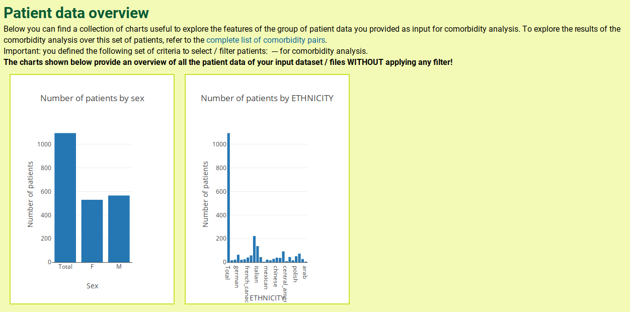
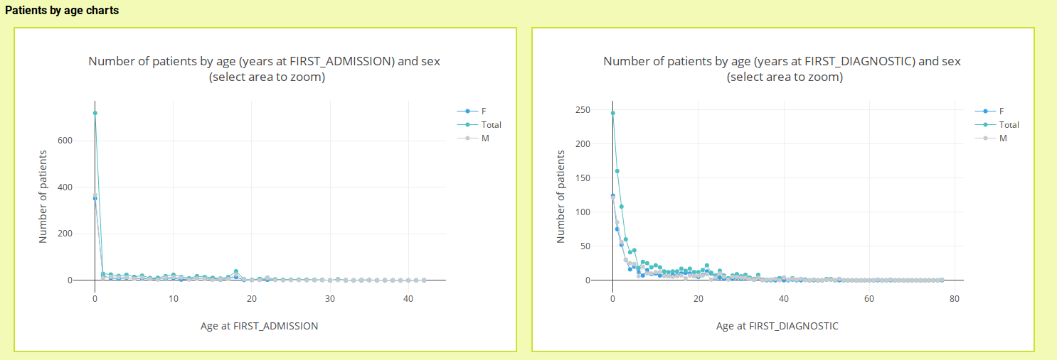
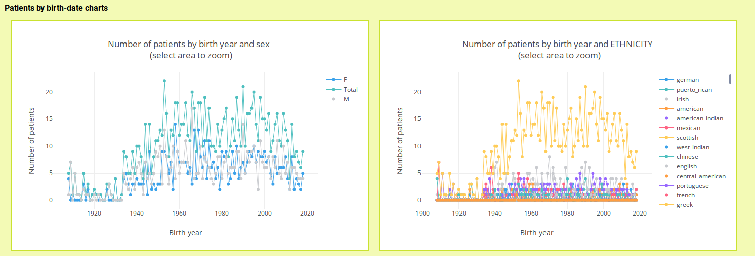
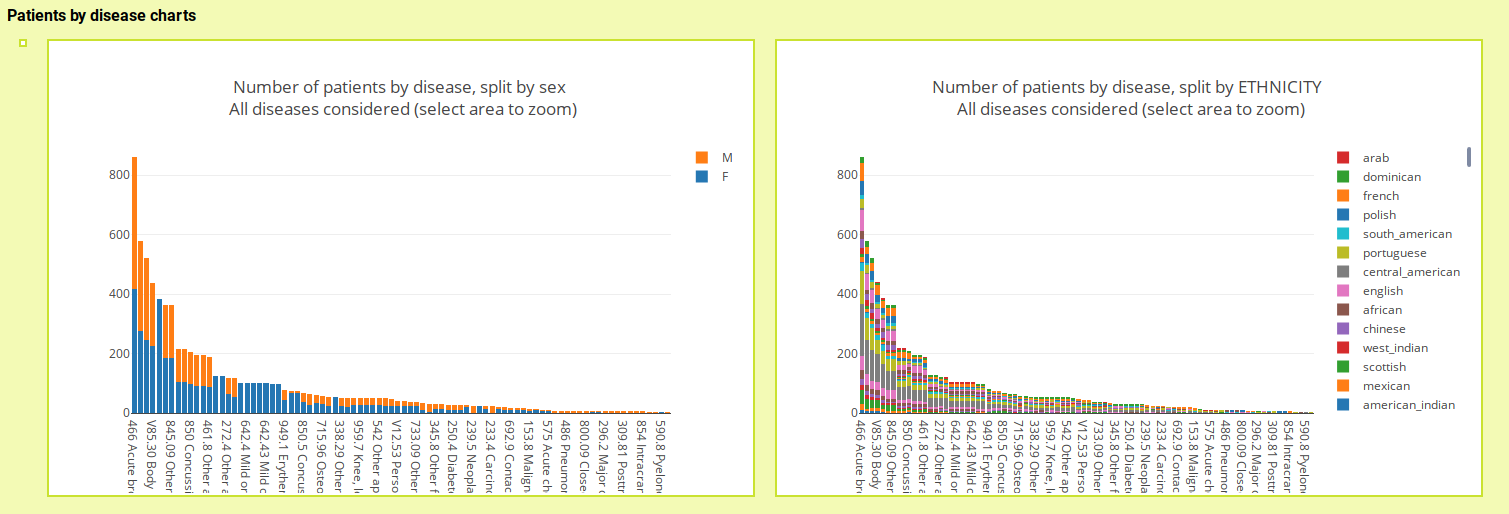
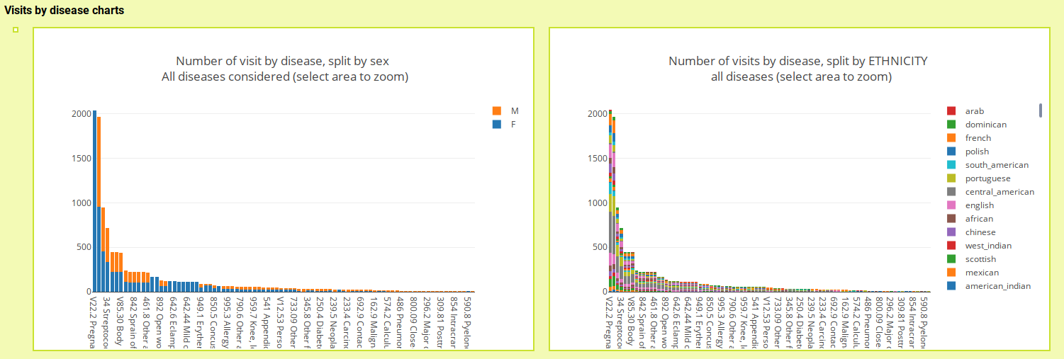
Patient data overview
Collection of interactive visualization to explore several aspects of the datasets of patient-diseases provided as input to Comorbidity4j, including: distribution of patients by age, gender and birth year, frequency of diseases total and by gender, number of visits total and by gender, etc.
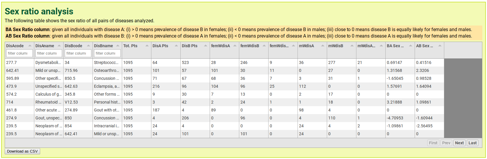
Sex ratio table
The Sex ratio table provides the results of the sex ratio analysis for all the diseases pairs considered in the analysis of comorbidity. How the sex ratio parameter is computed is detailed in the section describing Comorbidity scores.
For each pair of diseases A and b considered (row of the table), the sex ratio table provides two sex ration values (columns): the BA Sex Ratio: given all individuals with disease A: (i) > 0 means prevalence of disease B in females; (ii) < 0 means prevalence of disease B in males; (iii) close to 0 means disease B is equally likely for females and males and the AB Sex Ratio: given all individuals with disease B: (i) > 0 means prevalence of disease A in females; (ii) < 0 means prevalence of disease A in males; (iii) close to 0 means disease A is equally likely for females and males.
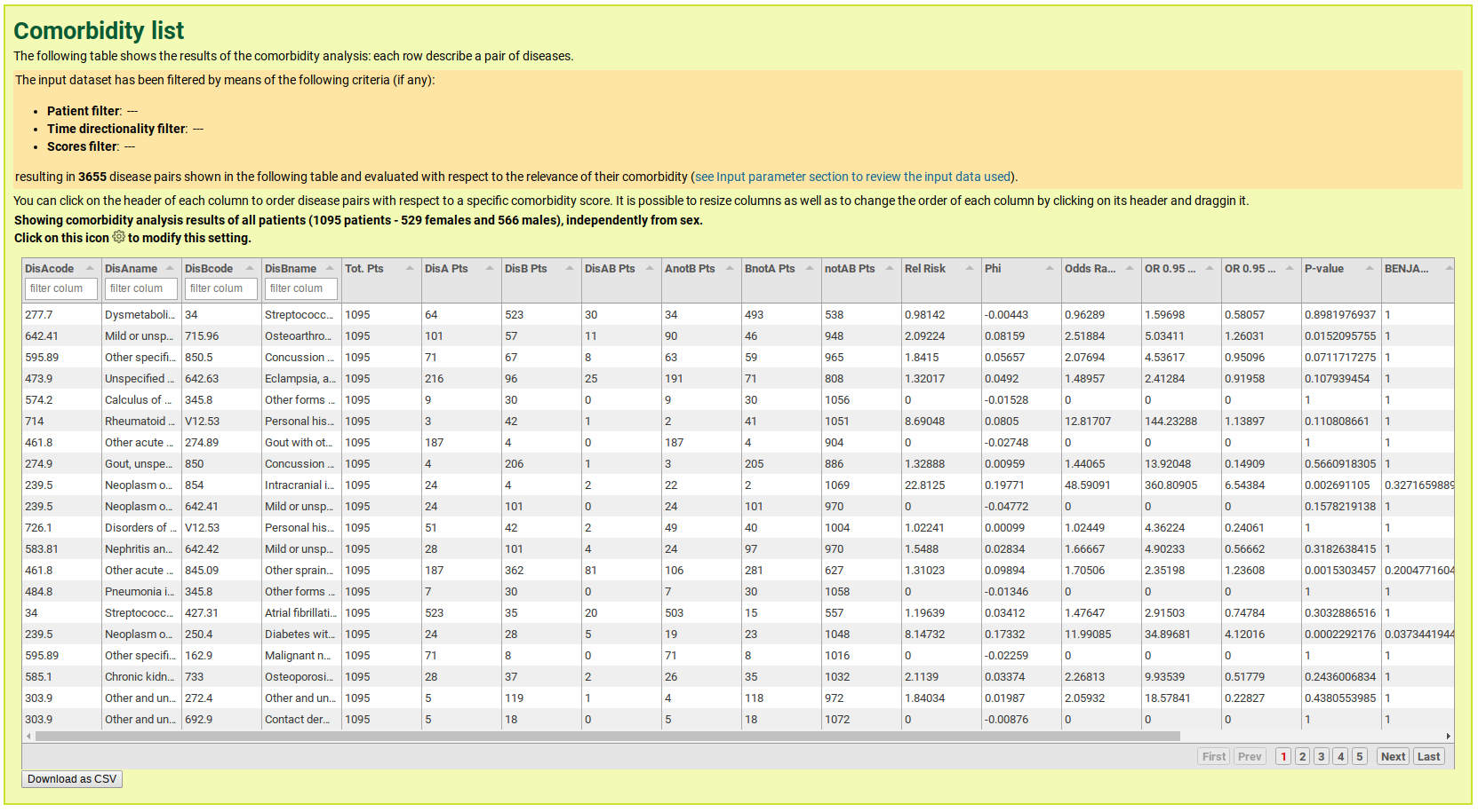
Comorbidity table
The Comorbidity table gathers the results of the comorbidity analysis. Besides the possibility to download the whole table as a CSV ('Download CSV button'), this Web table enables interactive browsing and filtering (order by different comorbidity scores, filter by disease name and code, etc.). More advanced interactive filters and visualizations are described below (Comorbidity interactive viz) in this documentation page.
Comorbidity interactive visualizations
This interactive visualizations enables users to define a set of criteria to filter the comorbidity pairs included in the Comorbidity table so as to generate dynamically interactive visualization of the filters' results. Such criteria include the comorbidity score values, the number of patients and the name of a specific disease (diagnosis) to be present in all the comorbidity pairs considered. The folloiwng image shows the filter setting Web tab:
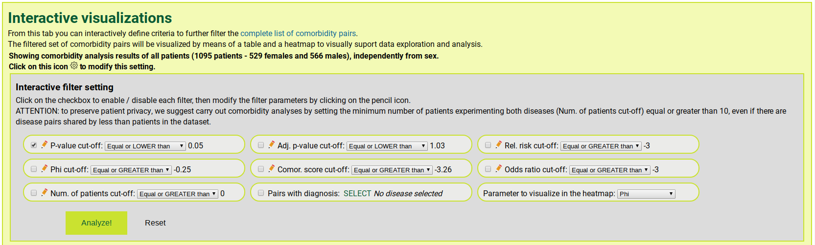
By applying these filters a subset of disease pairs is selected, starting from the comorbidity paris included in the Comorbidity table. This a subset of disease pairs is interactively shown and explored by means of the following set of visualizations.
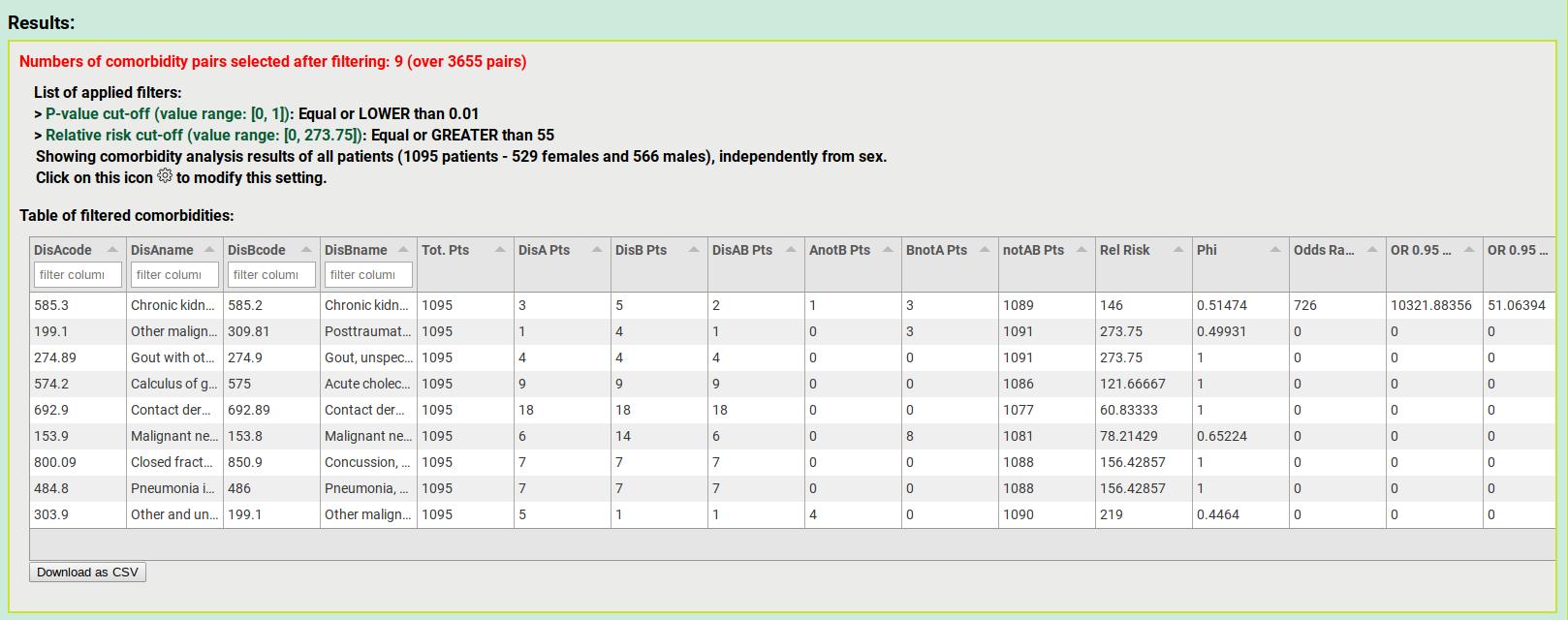
Viz 1: overview of filters applied and table of filtered comorbidity pairs
This visualization provides an overview of the set of filters applied to the comorbidity paris included in the Comorbidity table. It also enables users to browse and download a table gathering of the set of comorbidity pairs that passed the filters.
If the comorbidity analysis has been performed by considering time directionality, for each comorbidity pair shown in the table (row of the table), the first temporal occurring disease is the disease A, followed in time by the disease B.
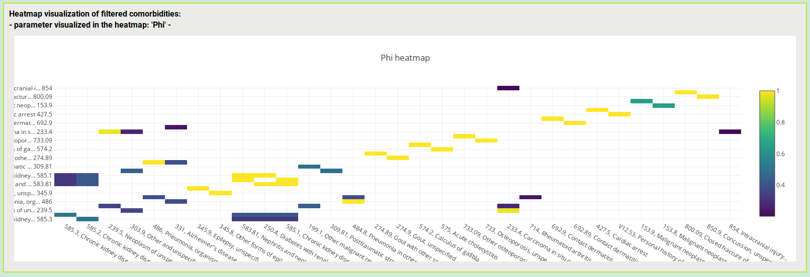
Viz 2: heatmap of filtered comorbidities
Here you can explore (interact with and zoom) the heatmap of filtered comorbidities. The comorbidity score (odds ratio, phi, etc.) shown in the heatmap is selected by the user together with the set of filters to apply.
If the comorbidity analysis has been performed by considering time directionality, for each comorbidity pair shown in the heatmap, the first temporal occurring disease is the one on the y-axis followed in time by the corresponding disease on the x-axis.
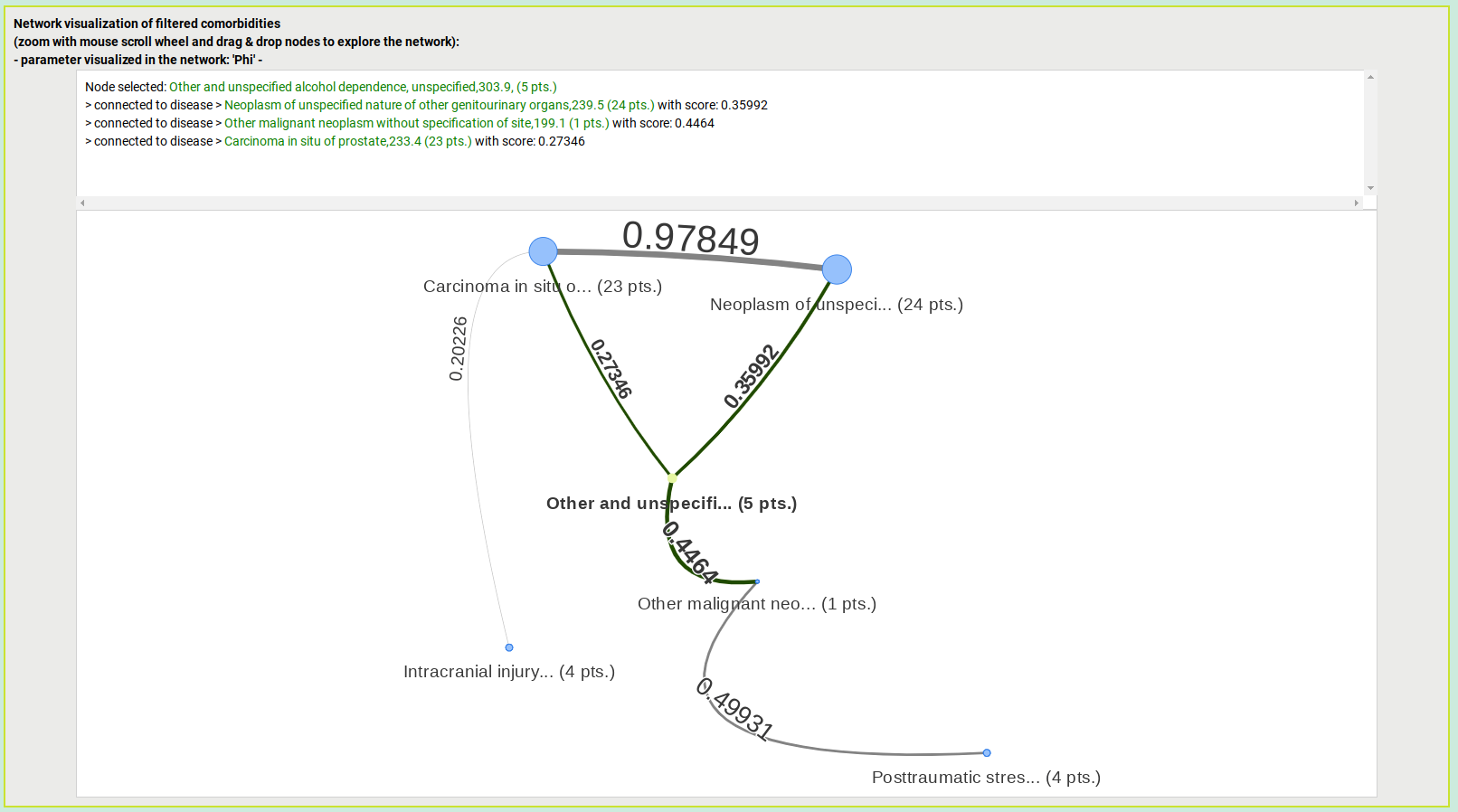
Viz 3: network visualization of filtered comorbidities
Here you can browse (zoom, arrange disease nodes, click on disease nodes to get more details) an interactive network visualization of the set of filtered comorbidities. Nodes represent diseases. Pairs of nodes are connected by arks that are labeled with the comorbidity score connecting that pair of diseases. The comorbidity score (odds ratio, phi, etc.) to show by the network visualization is selected by the user together with the set of filters to apply.
Arks are directional in case the comorbidity analysis has been performed by considering time directionality like in the following image. In particular, the arrow of the ark that connects a pair of diseases represents their time directionality (the arrow points to the second disease occurring in time).
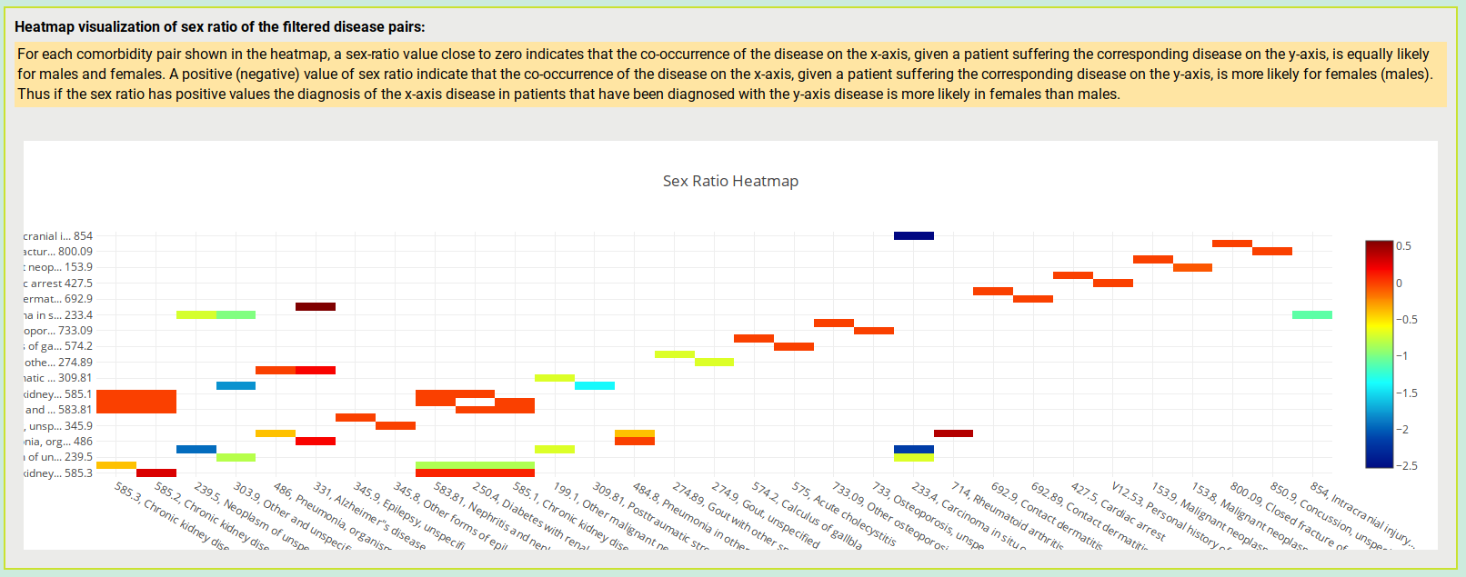
Viz 4: heatmap of sex ratio values of the filtered set of disease pairs
Here you can explore (interact with and zoom) the sex ratio of the filtered set of disease pairs. In particular, for each comorbidity pair shown in the heatmap, a sex-ratio value close to zero indicates that the co-occurrence of the disease on the x-axis, given a patient suffering the corresponding disease on the y-axis, is equally likely for males and females. A positive (negative) value of sex ratio indicate that the co-occurrence of the disease on the x-axis, given a patient suffering the corresponding disease on the y-axis, is more likely for females (males). Thus if the sex ratio has positive values the diagnosis of the x-axis disease in patients that have been diagnosed with the y-axis disease is more likely in females than males.